Most DAO websites look like they were designed by a committee that couldn’t agree on anything.
That’s often literally what happened. DAOs make decisions collectively, and collective decision-making produces predictable design outcomes: pages that try to represent every working group equally, navigation structures that reflect internal organizational debates rather than visitor needs, and hero sections written by people who care deeply about the mission but have never watched a stranger try to use the website for the first time.
The result is websites that communicate organizational complexity instead of organizational clarity. For an audience that’s already skeptical — that has seen enough failed DAOs to know the questions to ask — a confusing website is an early signal that the organization itself might be confused.
Good DAO website design solves this. Not by hiding complexity, but by presenting it in an order and structure that serves the visitor rather than the organization. This guide covers what that looks like in practice.
Design for Outsiders First
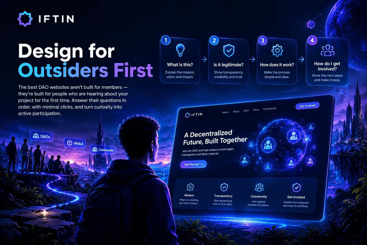
The most common DAO website design mistake is building for members rather than prospects.
Members already know where things are. They’ve bookmarked the governance forum, they’re in the Discord, they get the newsletter. They don’t need the website to orient them — they’re already oriented.
The visitor who matters most for a DAO website is the one who just heard about the project for the first time. That visitor has questions the website needs to answer in sequence: What is this? Is it legitimate? How does it work? How do I get involved? Those questions need to be answerable in that order, by someone with no prior context, without clicking more than two or three times.
Every design decision on a DAO website should be evaluated against this visitor. Not “does this section represent our working groups accurately” but “does this section help a first-time visitor understand what we’re doing and whether to get involved.”
Navigation: Simplicity Over Completeness
DAO navigation structures tend to sprawl. Every working group wants representation. Every content type gets its own menu item. The result is navigation with twelve items, sub-menus three levels deep, and no clear path for any specific visitor type.
Effective DAO website navigation covers the questions visitors actually have, in the order they have them:
Home | About | Governance | Treasury | Docs | Blog | Join
Seven items. Each maps to a distinct visitor intent. No sub-menus required for the primary navigation. Secondary items — specific working groups, individual documentation sections, community channels — belong in footers, sidebar navigation within relevant sections, and the pages themselves.
The “Join” item deserves specific attention. Most DAO websites bury their community entry point in the footer or the contact page. For a DAO whose growth depends on contributor participation, the path to getting involved should be one click from anywhere on the site. If your navigation doesn’t include a direct path to community entry, fix that before anything else.
Visual Design: Dark Mode Is a Default, Not a Choice
The Web3 space has converged on dark interfaces as a default. This isn’t arbitrary — dark interfaces reduce eye strain for the developer and researcher audience that spends significant time on screens, and they create a visual association with the technical seriousness that Web3 projects want to project.
For DAO websites specifically, dark design done well communicates: technical credibility, seriousness of purpose, and alignment with the aesthetic language of the space the DAO operates in.
Dark design done poorly communicates: low contrast text that’s hard to read, sections where dark content gets lost against dark backgrounds, and visual monotony that makes it impossible to create hierarchy.

The practical design decisions that separate effective dark DAO interfaces from ones that don’t work:
Contrast ratios matter more on dark backgrounds. Body text on a dark background needs higher contrast than on white to remain readable. Gray text on dark backgrounds — a common choice — needs to be tested against WCAG contrast standards, not just chosen by eye.
Surface differentiation requires deliberate choices. On light interfaces, cards and sections are differentiated with shadows and borders. On dark interfaces, you need slightly different background colors for different surface levels — a base background, a card surface, an elevated surface — to create visual hierarchy without relying on shadows that don’t read on dark backgrounds.
Color accent needs to work in limited application. On a dark DAO website, a single strong accent color — a governance purple, a protocol cyan, a treasury gold — does most of the work of creating visual hierarchy. That color needs to be used consistently and sparingly enough that it retains its signaling value.
Typography: Hierarchy That Carries Information
Web3 projects consistently underinvest in typography relative to their investment in illustration and animation. This is backwards. Most of what a DAO website communicates is text. The typography system determines whether that text is easy to process or not.
An effective DAO website typography system needs three levels clearly differentiated:
Display level — used for page titles and hero headlines. Large, high contrast, typically a heavier weight of the heading font. The display level sets the visual tone before a word is read.
Body level — used for all substantive content. Comfortable to read at length. Line length controlled to 65-75 characters for optimal readability. Line height generous — 1.6 to 1.7 times the font size for body content. This is where most of your visitors spend most of their time.
Supporting level — used for metadata, captions, labels, and secondary information. Visually subordinate to body text without being unreadable. Often slightly smaller and lighter weight.
Font choices for DAOs have developed informal conventions that are worth understanding. Geometric sans-serifs — Inter, Plus Jakarta Sans, Space Grotesk — read as technical and contemporary. Serif fonts read as institutional. Monospace fonts work well for addresses, proposal IDs, and numerical data. A combination of a geometric sans for body text and a slightly more distinctive geometric sans or display font for headings is the most common effective pattern.
Information Architecture: Organizing for Tasks, Not Structure
The most consequential design decision on a DAO website isn’t visual — it’s how information is organized. Information architecture that reflects how the organization is structured internally produces navigation that makes sense to members and confuses visitors. Information architecture that reflects what visitors are trying to do produces the opposite.
The tasks that DAO website visitors are actually trying to complete:
Understanding the project — What does this DAO do, what has it accomplished, who governs it, and how?
Evaluating participation — What does it mean to hold the token, participate in governance, or become a contributor? What are the requirements and what are the rewards?
Doing something specific — Submitting a proposal, finding documentation for a specific integration, locating the treasury address, understanding how to delegate voting power.
Design the information architecture around these tasks. The about page should answer the understanding questions. The join or community page should answer the participation evaluation questions. The documentation should answer the specific task questions. If information needed to complete one of these tasks is scattered across three different sections of the site, reorganize the site.
Governance Pages: The Credibility Test
The governance section of a DAO website is where organizational credibility is established or lost. It’s the section that sophisticated visitors, journalists, and potential institutional partners read most carefully. It’s also the section that most DAO websites treat as an afterthought.
Effective governance page design covers the mechanism clearly enough that a motivated outsider could participate without asking for help:
How proposals get submitted — Who can submit, what the requirements are, where submissions happen.
How voting works — The mechanism, the timeframe, what quorum looks like, whether delegation exists and how it works.
What governance decides — What categories of decisions go through governance versus what the founding team or multisig controls unilaterally. Being honest about this, including the parts where the DAO is more centralized than the name implies, is a credibility signal rather than a weakness.
Where to see history — Links to past proposals, voting records, and execution history. On-chain governance history is publicly verifiable. Making it easy to find signals that you want people to look.
The governance page design itself should prioritize readability and navigation over visual complexity. This is a page people read carefully, not scan. Long-form content with good heading structure, clear links to external governance tools, and an honest description of how the system works is more valuable than an elaborate infographic of the voting process.
Treasury Visibility: Public Information Should Be Findable
DAO treasuries are typically on-chain and publicly visible whether or not the DAO publishes them. The design decision is whether to make this information easy to find or require visitors to go looking.
Projects that make treasury information easy to find — a dedicated treasury page, updated regularly, with current holdings and historical allocation — signal confidence and organizational transparency. Projects that don’t make this information easy to find signal the opposite, regardless of what their mission statement says about decentralization.
The treasury page doesn’t need to be elaborate. A table of current holdings, updated at a defined frequency, with links to on-chain verification and a brief description of allocation categories, is more valuable than a complex dashboard that’s never updated.
If your DAO uses a multi-sig, list the signers and their wallet addresses. If governance controls treasury allocation, link to the relevant governance proposals for major expenditures. If the treasury composition has changed significantly since launch, explain why. Transparency that requires no explanation is the most powerful kind.
Mobile Design for DAO Websites
DAOs attract communities that consume information on mobile devices. Discord links, Twitter threads, governance announcements — these are primarily mobile contexts. A DAO website that doesn’t work well on mobile is excluding a significant portion of its community from whatever experience the website is designed to create.
The specific mobile failures that appear most often on DAO websites:
Navigation that collapses poorly. A seven-item desktop navigation that collapses into a hamburger menu works fine if the menu is easy to open and the items are easy to tap. It doesn’t work when the mobile menu overlaps content, items are too close together to tap accurately, or closing the menu requires finding a small X button.
Governance information that’s formatted for desktop. Voting timelines, proposal tables, and treasury breakdowns often use horizontal layouts and small text that becomes unusable at mobile widths. Design these components for 375px width first and expand from there.
Long-form content without mobile optimization. DAO websites contain a lot of text — governance documentation, meeting notes, working group updates. On mobile, long-form content needs generous line height, comfortable font size, and line lengths that don’t require horizontal scrolling.
Performance as a Design Choice

Slow DAO websites send a signal. For organizations built on the premise that decentralized systems can be more efficient than centralized ones, a website that takes four seconds to load undermines the message before a word is read.
The performance choices that matter most for DAO websites:
Host fonts locally. Loading fonts from Google Fonts or Adobe Fonts creates external dependencies and adds DNS lookup time. Self-hosting font files eliminates both and removes a privacy concern that parts of your community may have.
Be selective with JavaScript. Animated token price tickers, live governance dashboards, and real-time treasury charts are compelling in concept and frequently disastrous for performance. If a piece of dynamic content requires significant JavaScript to render, ask whether it’s adding enough value to justify the cost. Static data that’s updated regularly often serves visitors better than live data that makes the page slow.
Prioritize above-the-fold performance. The first content a visitor sees should load fast even if everything below takes longer. Defer loading of heavy assets that appear below the scroll line.
The Bottom Line
DAO website design is an organizational communication problem as much as a visual one. The visual choices — dark interfaces, strong typography, deliberate color use — matter and are worth doing well. But they matter less than whether the site answers the right questions in the right order for the visitors who most need to understand and trust the organization.
The DAOs with the most effective websites are not necessarily the ones with the largest design budgets. They’re the ones that decided what the website was for, who it was serving, and what it needed to communicate — and then built that, rather than building a representation of how the organization sees itself.
Design the website for the person evaluating whether to trust you. That person is the most important visitor you have.
Want to go deeper? Read our guides on How to Create a DAO Website Using WordPress FSE and Essential Pages Every Web3 Startup Website Needs .