Most Web3 projects don’t have a conversion problem. They have a clarity problem.
The landing page exists. The design is often striking — dark backgrounds, gradient accents, animated token visuals. But visitors land, spend twenty seconds reading, and leave without taking any action. Not because the product isn’t interesting. Because the page never told them clearly enough what the product does, who it’s for, and what they should do about it.
A startup landing page is a deceptively simple artifact. One page. One audience. One job. Getting that job done in a Web3 context requires understanding some things about the audience that most landing page advice ignores.
Who Actually Lands on a Web3 Startup Page
The traffic profile of a Web3 startup landing page is unusual compared to mainstream SaaS.
A significant percentage arrives from Discord links, Telegram shares, and Twitter threads. These visitors are already in a research posture — they’ve seen a mention of your project somewhere and they’re doing due diligence. They’re not casually browsing. They came to evaluate.
Another segment arrives from search — people looking for solutions to specific problems in DeFi, DAO tooling, NFT infrastructure, or cross-chain interoperability. These visitors have a defined need and they’re comparing options.
A smaller but disproportionately important segment is developers and technical contributors who are evaluating whether to build on your protocol, integrate with your product, or contribute to your codebase. This group reads the fine print. They check the GitHub repository linked in the footer. They notice if your documentation link leads to a 404.
Each of these visitor types needs something slightly different from your startup landing page. The best pages serve all three without trying to address each explicitly.
The Hierarchy of Information
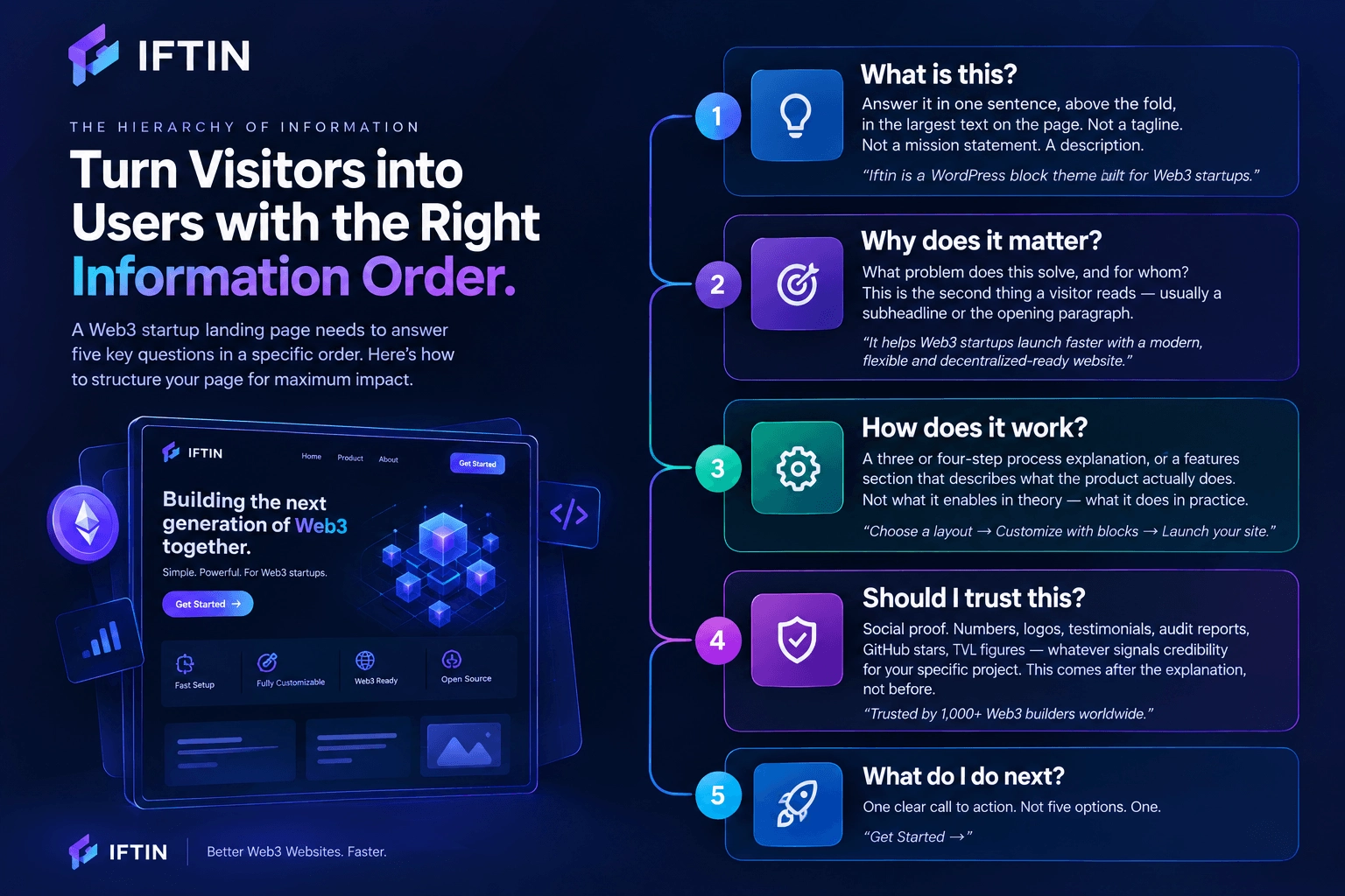
Before writing a single word of copy or placing a single block in your editor, get the information hierarchy right.
A Web3 startup landing page needs to answer questions in a specific order, because visitors make exit decisions fast and sequentially:
Question 1: What is this? Answer it in one sentence, above the fold, in the largest text on the page. Not a tagline. Not a mission statement. A description. “Iftin is a WordPress block theme built for Web3 startups” answers the question. “The Future of Decentralized Everything” does not.
Question 2: Why does it matter? What problem does this solve, and for whom? This is the second thing a visitor reads — usually a subheadline or the opening paragraph of the hero section. It should name the pain specifically enough that the right person recognizes themselves.
Question 3: How does it work? A three or four-step process explanation, or a features section that describes what the product actually does. Not what it enables in theory — what it does in practice.
Question 4: Should I trust this? Social proof. Numbers, logos, testimonials, audit reports, GitHub stars, TVL figures — whatever signals credibility for your specific project. This comes after the explanation, not before it.
Question 5: What do I do next? One clear call to action. Not five options. One.
Every section of your startup landing page should map to one of these questions. If a section doesn’t answer a question a visitor is actually asking, it’s decorative — and decoration is expensive on a page where attention is scarce.
Above the Fold: The Only Section That’s Guaranteed to Be Read
Every other section of your startup landing page depends on the hero working well enough to earn the scroll.
The hero section of a Web3 startup landing page has four jobs:
State what the product is. Directly. In plain language. The crypto space has trained founders to communicate obliquely — to gesture at transformation rather than describe function. Resist this. “A decentralized protocol for cross-chain asset swaps” is better than “The bridge between worlds.”
Identify who it’s for. Even a subtle signal — “built for DeFi developers” or “for DAOs managing multi-sig treasuries” — filters the audience in a way that increases conversion among the right visitors while reducing bounce from the wrong ones.
Show the product. A dashboard screenshot, a wallet interface mockup, a protocol diagram — something visual that concretizes what the visitor just read. Abstract hero illustrations score well in design reviews and poorly in A/B tests.
Give them somewhere to go. One primary CTA. If you have a product they can try, that’s the CTA. If you’re in pre-launch, it’s an email waitlist. If you’re targeting developers, it’s a link to the documentation. Match the CTA to the most likely action the most valuable visitor would take.
The split-screen layout — headline and CTA on the left, product visual on the right — has become the dominant pattern for Web3 startup landing pages for a reason. It satisfies the text-first visitors and the visual-first visitors simultaneously without making either group work harder than necessary.
Social Proof in a Web3 Context
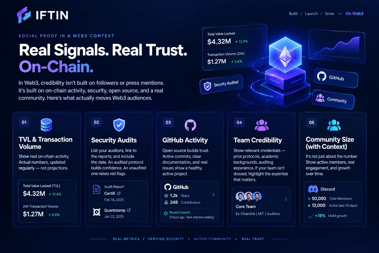
Social proof works differently in Web3 than in mainstream SaaS. Follower counts and press mentions matter less. On-chain metrics, audit reports, and technical credibility signals matter more.
The credibility signals that actually move Web3 audiences:
TVL and transaction volume. If your protocol has meaningful on-chain activity, put the numbers on the landing page. Real numbers — not projections, not “potential” — updated regularly. A protocol with $2M TVL that displays it prominently signals more confidence than a protocol with $20M TVL that buries the figure in the documentation.
Security audits. List your auditors, link to the reports, and include the date. An unaudited protocol asking for user funds is a red flag most technical visitors will catch. An audited protocol that makes the audit easy to find is doing the opposite of hiding something.
GitHub activity. Open source projects should link to their repository. Developer-facing projects should make the GitHub link prominent enough to find without hunting. A repository with recent commits, meaningful documentation, and active issues signals organizational health that no amount of marketing copy can replicate.
Team credibility. Not every Web3 project needs to be doxxed. But if your team has relevant credentials — prior protocols, academic backgrounds, auditing experience — these belong on the landing page where they can do work, not buried in an about page that most visitors won’t reach.
Community size with context. “50,000 Discord members” is a number. “50,000 Discord members, 12,000 active in the last 30 days” is a signal. The distinction matters to the technical visitors who are calibrated to spot inflated community metrics.
The CTA Problem Most Web3 Pages Get Wrong
The most common conversion failure on a Web3 startup landing page isn’t a bad headline or a slow load time. It’s CTA proliferation.
Visit any ten Web3 startup landing pages and count the distinct calls to action on each one. The average will be somewhere between six and twelve. Join Discord. Follow on Twitter. Read the whitepaper. Connect your wallet. Apply to the grants program. Subscribe to the newsletter. Join the waitlist. Read the docs.
Each of these is individually reasonable. Together, they’re paralysis. A visitor who arrives with genuine intent to engage gets presented with an equal menu of engagement options and frequently chooses the one that requires the least commitment — which is usually closing the tab.
Good startup landing pages make a hierarchy decision about CTAs and enforce it visually. One primary action, displayed prominently, repeated at strategic points down the page. Secondary actions present but visually subordinate — smaller, less prominent, not competing for the same visual weight.
For most Web3 projects, the primary CTA hierarchy looks like this:
- Product exists and is live: Try the product or connect wallet
- Pre-launch with defined timeline: Join the waitlist
- Developer-focused: Read the documentation or explore the API
- Community-first: Join the governance forum
Everything else — Discord, Twitter, newsletter — belongs in the navigation or the footer, accessible to visitors who want it without competing with the primary conversion action.
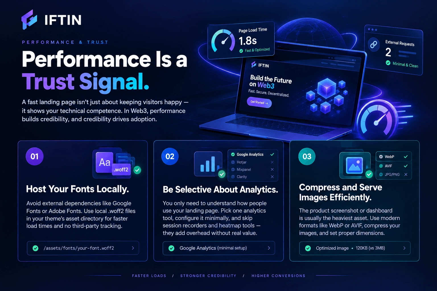
Performance Is a Trust Signal
A startup landing page that takes four seconds to load isn’t just losing visitors to impatience. It’s signaling something about organizational competence to the visitors who stay.
The Web3 audience is technically literate. Many of them run browser extensions that show page load times, request counts, and third-party script inventories. A landing page that makes fourteen external requests before rendering — to analytics platforms, font providers, marketing tools, and session recorders — is observable to this audience in ways that a mainstream SaaS audience wouldn’t notice.
The performance decisions that matter most for a Web3 startup landing page:
Host your fonts locally. Loading fonts from Google Fonts or Adobe Fonts creates an external dependency and adds latency. Hosting .woff2 files in your theme’s asset directory eliminates both problems and keeps your infrastructure free of third-party tracking that your community may object to.
Be selective about analytics. You need to understand how people use your landing page. You don’t need twelve analytics tools to do that. Pick one, configure it minimally, and skip the session recorders and heatmap tools on a page this simple — they add overhead without proportional insight.
Compress and serve images efficiently. The product screenshot or dashboard mockup in your hero section is usually the heaviest asset on the page. Compress it, serve it in a modern format, and set appropriate dimensions. A hero image that forces the browser to download a 3MB PNG is a choice that has measurable conversion consequences.
Copy That Works for Technical Audiences
Web3 audiences read landing page copy differently than mainstream audiences. A few patterns that work and a few that reliably don’t:
What works:
Specificity over aspiration. “Swap any ERC-20 token in under 30 seconds with no slippage above 0.3%” outperforms “Seamless DeFi for everyone” with technical audiences every time. The specific claim is falsifiable — and a falsifiable claim signals confidence that an aspirational tagline cannot.
Honest acknowledgment of limitations. Mentioning what your protocol doesn’t do, or what its current constraints are, builds more trust with sophisticated readers than pretending the product is perfect. Nobody in Web3 believes the landing page — honesty is differentiation.
Plain language for complex concepts. If your product requires understanding a novel cryptographic primitive, explain it in plain language first, then offer the technical depth for readers who want it. Don’t assume the visitor has read your whitepaper before landing on your page.
What doesn’t work:
Jargon as a substitute for explanation. “Hyper-scalable omnichain liquidity aggregation protocol” is nine words that communicate less than “a tool that finds you the best swap price across multiple blockchains.” Use the second version on the landing page. Save the first version for the technical documentation.
Urgency theater. Countdown timers to token sales, “limited allocation” messaging, and artificial scarcity signals read as manipulation to audiences that have seen these tactics deployed in failed projects repeatedly. They lower trust, not raise it.
Roadmap as social proof. A roadmap on a landing page that lists features planned for the next eighteen months is not evidence of progress — it’s a list of things that haven’t happened yet. Ship something, then talk about what you shipped. The roadmap page is for roadmap content.
The Bottom Line
A Web3 startup landing page that converts isn’t mysterious. It answers the right questions in the right order, makes one conversion request clearly and repeatedly, loads fast enough not to lose impatient visitors, and communicates with the precision that technically literate audiences respond to.
The projects that get this right don’t necessarily have the best products — at least not initially. But they have the clearest articulation of what their product does and why it matters. In a space as noisy as Web3, clarity is a competitive advantage that compounds over time.
Build the landing page like you’d write a smart contract: precise, auditable, and free of unnecessary complexity.
Want to go deeper? Read our guides on How to Create a DAO Website Using WordPress FSE, and How to Build a Modern Web3 Startup Website.