Designing a token launch landing page requires a narrower focus than most Web3 pages.
It’s not trying to explain your entire project. It’s not building brand awareness or educating the market about blockchain technology. It’s doing one thing: converting a skeptical visitor into someone who takes a specific action — joining a waitlist, completing KYC, connecting a wallet, or participating in a sale — before they leave.
Most token launch landing pages fail at this job not because the project is weak but because the page was designed by people who know the project too well. They include everything that seems important from the inside, in an order that makes sense to the team, for an audience that already understands the context. The visitor — who arrived from a tweet three minutes ago and has seventeen other tabs open — never had a chance.
This guide covers how to design a token launch landing page that actually converts, what to include, what to cut, and how to sequence information for the audience that matters most.
Understanding the Audience Before Designing Anything
The traffic profile of a token launch landing page is different from most marketing pages, and designing without understanding that profile produces predictable failures.
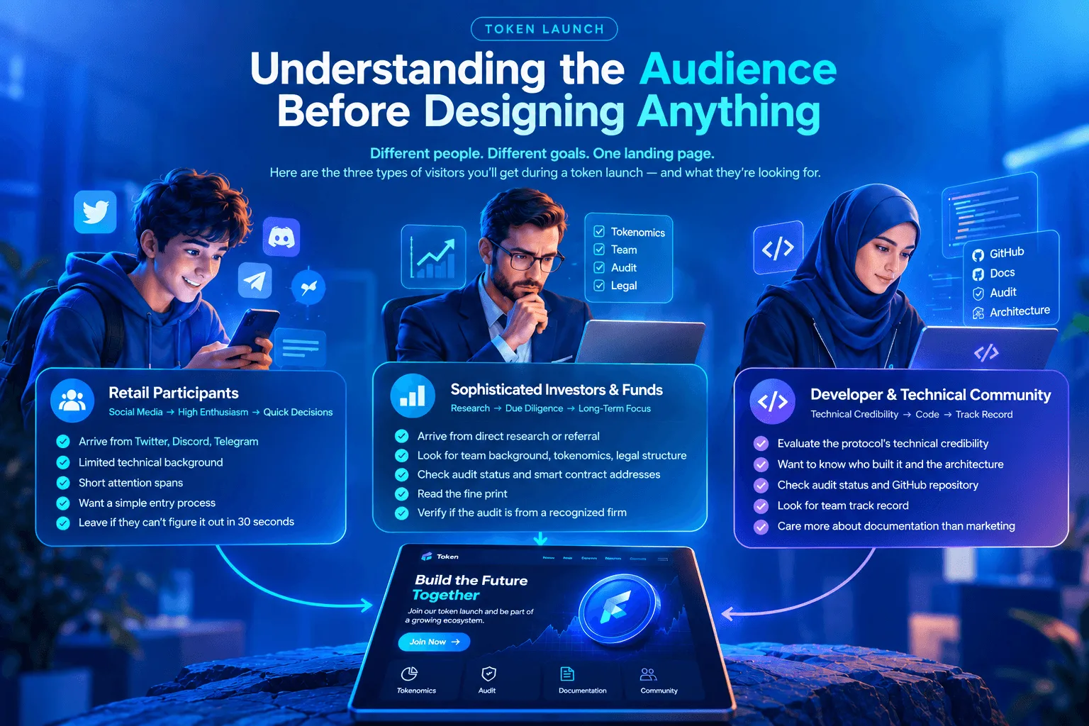
Three distinct visitor types land on a token launch page during a launch window:
Retail participants arrive from social media — Twitter threads, Discord announcements, Telegram channels. They have limited technical background, high enthusiasm, and short attention spans. They’re evaluating whether this project feels legitimate and whether the entry mechanism is simple enough to navigate. If they can’t figure out what to do within thirty seconds, they leave.
Sophisticated investors and funds arrive from direct research or referral. They’ve already done preliminary due diligence. They’re looking for specific information — team background, tokenomics, legal structure, audit status — and they’ll find it or conclude it doesn’t exist. They read the fine print. They check the smart contract addresses. They notice if the audit report is from a firm they recognize.
Developer and technical community members arrive to evaluate the protocol’s technical credibility. They want to know who built it, what the architecture looks like, whether the contracts have been audited, and whether the team has a track record. They’re less interested in the marketing copy and more interested in what the GitHub repository looks like and who wrote the documentation.
A high-converting token launch landing page serves all three of these visitors in sequence — retail visitors with the above-the-fold experience, sophisticated investors with the detailed sections below, and technical visitors with the documentation and audit links that need to be present somewhere on the page.
The Structure That Actually Works
Above the Fold: The Only Guaranteed Impression
Everything above the scroll line needs to answer three questions simultaneously: what is this, why does it matter, and what do I do right now.
The headline is not the place for poetry. “Decentralized Liquidity for the Multi-Chain Future” might sound good in a team meeting. It communicates nothing to a visitor arriving cold. “A token that lets you earn yield across twelve blockchains without bridging assets” answers the question. Use the second version.
The subheadline adds the why — what problem this solves and why existing solutions fall short. One or two sentences. Specific enough to be falsifiable, brief enough to be read.
The call to action is singular. Not “Join Waitlist | Read Whitepaper | Connect Wallet | Follow on Twitter.” One button, one action, one decision. If the launch is live, it’s “Connect Wallet.” If you’re in pre-launch, it’s “Join Waitlist.” Everything else competes with the primary action and reduces conversion.
The visual element in the hero needs to concretize what the visitor just read. An abstract illustration of interconnected nodes doesn’t help. A dashboard screenshot, a wallet interface showing the yield mechanism, or a simple diagram of how the protocol works — something that makes the product real — helps considerably.
The Trust Layer: Before Any Purchase Decision
Between the hero and the participation mechanism, there needs to be a trust-building section. This is the section most token launch pages either skip entirely or bury at the bottom.
For retail visitors, trust signals are: logos of known investors or partners, total value locked if the protocol is live, number of participants in early access, and team names with verifiable backgrounds.
For sophisticated visitors, trust signals are: audit reports from recognized firms, smart contract addresses that can be verified on-chain, legal structure and jurisdiction, and vesting schedules that align team incentives with long-term performance.
Both groups need both sets of signals — retail visitors who see an audit badge from a credible firm feel safer even if they can’t read the audit, and sophisticated investors who see a strong community participation number have additional signal on market demand.
The Tokenomics Summary: Honest, Visual, Specific
The tokenomics section on a token launch landing page should be a summary, not the full documentation. The summary needs: total supply, distribution breakdown in a chart or table, launch price or valuation if applicable, vesting schedule for team and investor allocations, and a link to the full tokenomics documentation.
The common mistake is making this section aspirational. “Token designed for long-term value accrual” is not information. “Protocol fees are distributed to stakers on a weekly basis; 30% of fees go to the treasury” is information.
Visitors who are evaluating whether to participate in a token sale are making a financial decision. They need facts, not framing. Provide the facts and let them decide.
The Team: Specific and Verifiable
Anonymous teams are a fact of Web3 life. Fully doxxed teams with LinkedIn profiles are not the only path to credibility. But the team section needs to do actual work regardless of how much identity information is shared.
A team section that lists four names and four titles does nothing. A team section that lists relevant prior experience — “previously core contributor to Protocol X,” “led smart contract development at Company Y for three years,” “PhD in cryptography from University Z” — gives a visitor something to evaluate.
If the team is anonymous, compensate with everything else that can be verified: audit history, on-chain track record, open source contributions, and community governance participation. Anonymous teams that have shipped multiple audited protocols carry more credibility than doxxed teams with no track record.
The Participation Mechanism: Make It Impossible to Fail
The participation mechanism is where most token launches lose participants who were otherwise convinced.
A wallet connection flow that requires three separate approvals with no explanation of what each approval does loses retail participants at every step. A KYC process that redirects to a third-party platform without warning loses participants who weren’t expecting it. A purchase flow that shows gas fees without context loses participants who don’t understand that $40 in gas is normal on mainnet during a busy period.
Design this section for the participant who has never done this before. Assume nothing. Explain every step. If there’s a minimum purchase, state it before someone connects their wallet. If KYC is required, say so in the hero section — not buried in the FAQ.
For retail participants especially, the difference between a smooth participation flow and a confusing one is the difference between a completed transaction and a bounced visitor who tells their Discord channel that your launch was “sketchy.”
What to Cut
The instinct when building a token launch landing page is to include everything. Every feature, every partnership, every advisor name, every roadmap milestone. This instinct is wrong.
Cut the extended roadmap. A roadmap belongs on your project website, not on the launch page. On a launch page, it’s a distraction from the conversion action.
Cut the lengthy whitepaper summary. Link to the whitepaper. Don’t summarize it in eight paragraphs on the landing page. Visitors who want the technical depth will read the whitepaper. Visitors who don’t want it will bounce before reaching the participation mechanism.
Cut the social media feed embeds. Live Twitter feed widgets, Discord activity counters, and similar dynamic elements add load time and visual noise without adding information that helps someone decide to participate.
Cut the countdown timer — usually. Countdown timers create urgency. They also create the impression of a limited-time promotional offer, which is a cognitive frame that sophisticated investors don’t respond to positively. If your launch has a genuine end date, state it in text. A ticking clock looks like pressure, not information.
Cut the advisor list of twenty people. Three advisors with relevant credentials and genuine involvement are worth more than twenty names that represent resume padding. Investors who know the space will recognize the names. Those who don’t won’t be impressed by the number.
Mobile Is Not Optional
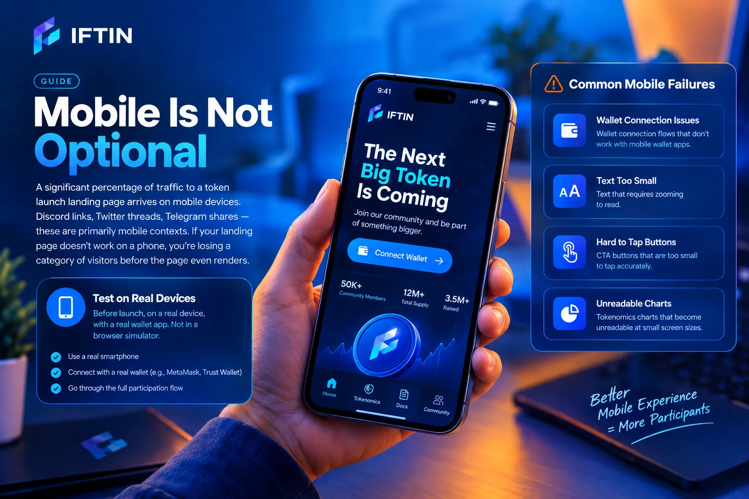
A significant percentage of traffic to a token launch landing page arrives on mobile devices. Discord links, Twitter threads, Telegram shares — these are primarily mobile contexts. If your landing page doesn’t work on a phone, you’re losing a category of visitors before the page even renders.
The specific mobile failures that are most common: wallet connection flows that don’t work with mobile wallet apps, text that requires zooming to read, CTA buttons that are too small to tap accurately, and tokenomics charts that become unreadable at small screen sizes.
Test the participation flow on mobile before launch, on a real device, with a real wallet app. Not in a browser simulator. The failure modes that matter are the ones that happen on actual hardware.
Performance Under Launch Traffic
Token launches generate traffic spikes. A project that generates normal traffic of a few hundred visitors per day can receive tens of thousands of visitors in an hour during a launch announcement.
A token launch landing page that works correctly at normal traffic and crashes under launch traffic is a failure at the worst possible moment. The visitors who arrive during the announcement window are the most motivated visitors the page will ever see. Losing them to a slow load time or a server error is not recoverable.
Use a CDN. Cache aggressively. Test under load before launch, not during it. If your page depends on a third-party API for real-time data — token price, participation counter, TVL — have a fallback for when that API is slow or unavailable.
After the Launch: Keep the Page Current
The token launch landing page doesn’t end at the close of the sale. It becomes the primary reference point for new participants learning about the project for months afterward.
Update the CTA to reflect the new status. Replace “Join Sale” with “Buy on Exchange” or “Stake Tokens” or whatever the relevant next action is. Update the participation counter with final numbers. Link to the post-launch documentation and governance forums.
A launch page that still says “Sale Ends in 3 Days” eight months after the sale closed is a trust problem that compounds silently every time a new visitor lands on it.
Token Launch Landing Page: The Bottom Line
A high-converting token launch landing page is not the most creative page you’ll build. It’s the most disciplined one. Every element either helps a visitor move toward the participation decision or it doesn’t belong on the page.
The projects that convert well during launches are not the ones with the most impressive hero sections or the most elaborate tokenomics visualizations. They’re the ones that made it easy to understand what they’re building, easy to trust that the team is credible, and easy to participate without confusion.
Build the page for the visitor who arrived from a tweet thirty seconds ago and has seventeen other tabs open. If that visitor can understand what you’re offering and complete the participation flow without asking for help, the page is working.
Want to go deeper? Read our guides on Startup Landing Page Best Practices for Web3 Projects, Essential Pages Every Web3 Startup Website Needs, and Why Block Themes Are Perfect for Web3 Landing Pages.